A well-designed nonprofit website can play a major role in inspiring donors to give.
In fact, even simple things like putting your donate button in the right spot, showcasing security, and using lightbox pop-ups can have a big impact on online fundraising.
Nonprofit organizations that employ these simple website design best practices will raise more money.
In this blog we reveal the top 10 nonprofit website design best practices to improve online fundraising. We also share some great examples of nonprofit websites that got it right to help inspire!
Here are the 10 best practices for nonprofit web design:
- Highlight your donate button
- Showcase security
- Direct attention with lightbox Pop-ups
- Design effective donation forms
- Optimize your blog for online fundraising
- Make your site searchable (SEO)
- Use compelling visual designs
- Optimize for mobile
- Maximize video content
- Include multiple giving options
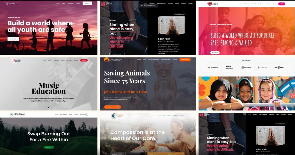
If you need help with nonprofit website design, Partner Web has some beautiful website templates to choose from with all of these best practices built-in.
1. Highlight your Donate Button
Your nonprofit site is a key way for community members to support you, so you’ll want to make this process as easy as possible! One way to do this is to place your donation button front and center.
Include a donate button on every page of the site – not just your homepage. Most nonprofits have their donation buttons in the top right of the navigation bar and donors are conditioned to look there, so make sure you include one here if you’re designing a new website.
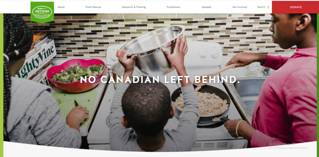
Use a color scheme that includes bright colors and enough contrast to make your donation button stand out. Our eyes are naturally drawn to bright colors that contrast with backgrounds, so create a bold donation button that stands out from the rest of your color scheme. For example, Second Harvest Food Rescue, made their donation button red so it really stands out, even though their brand colors are green.
A few more tips to keep in mind while designing donation buttons for a new website:
- Check that your donate button links to the correct page and the page loads quickly
- Use words to convey a sense of urgency – for example instead of ‘Donate’ you could use ‘Donate Now.’
- Make sure your button text is brief and clear, you can also use alternatives like “Give,” “Give Today,” or “Support Our Work”
- Get creative with donation buttons and think about pairing them next to a fundraising thermometer or adding an option to host a fundraiser beside them – this will encourage prospective donors to engage with your organization’s mission in more ways.
2. Showcase Security
The key to online donations is developing a sense of trust and security with the people that visit your site. Prospective donors want to know that their transactions are secure and will only donate on your nonprofit’s website if they trust it.
According to Interac Canada, 60% of Canadians are more worried about fraud than ever before, a trend that’s present in other countries as well. Building a sense of security and trust is therefore key to encouraging online fundraising. For example, Partner Web does nonprofit website development on WordPress and hosts the websites on AWS to make sure they’re safe and secure.
Take a look at how Charity: Water includes secure payment and privacy markers right under the donate button to make sure that potential donors don’t shy away from donating.
Here are some nonprofit website design best practices to display security and trust:
- Include your charity registration number on your website and donation pages
- List any accreditations or trust markers associated with your nonprofit – these can include certificates, awards, or affiliations you have with other organizations
- Make sure your donation page carries your brand identity – if your donation form opens in a new window or navigates away from your main site, donors may become unsure about the transaction. Add your logo, color scheme, and other brand details to create a trustworthy giving experience.
- Use a reputed payment gateway with verified safety standards that donors recognize. Also, make sure it’s PCI-compliant. PCI compliant donation processors protect donors from having their information stolen.
- Consider including information on your donation page about what you’re doing to keep your donors safe so they can feel more at ease about sharing personal information.
3. Direct Attention with Lightbox Pop-ups
Lightbox pop-ups are a powerful nonprofit website design tool because they’re impossible to miss. They appear when site visitors are either browsing a page for a few seconds or trying to close the page. These pop-ups black out all other information so that website visitors can only focus on one thing.
Since they draw so much attention – you’ll need to be careful with what content to put on the pop-up and how you use them. They’re ideal for urgent situations, special appeals or upcoming events.
Here are some occasions to use a lightbox pop-up as part of your nonprofit website development and design:
- Important online fundraising campaigns – year-end, giving season etc.
- Special offers like a matching gift campaign
- Natural disaster relief or emergency situations your nonprofit is responding to
Here’s how The Humane Society of the United States used a lightbox pop up to increase their online fundraising.

Remember: Pop-ups can be annoying if overused! The best nonprofit websites use this tactic sparingly and keep them on for a limited time, so donors take them seriously!
4. Design effective donation forms
When it comes to donation forms, your design choices can be the difference between a donation and people navigating away. The best nonprofit websites use an integrated nonprofit donation form with a clear brand identity to provide website visitors with a seamless user experience.
Here are a few nonprofit web design tips for creating effective donation forms:
- As mentioned earlier, integrated forms build trust and make it less likely that site visitors will navigate away from your page. Make sure your brand identity shows through clearly by using similar colors, language and images – even if it is hosted by a third-party vendor.
- Include a line emphasizing your organization’s mission to remind potential donors of where their donation will go
- Use pre-set giving amounts to make the choice easier for donors, but include a space for custom amounts
- Use buttons instead of a drop-down menu for donation options as these are clearly visible and easier to navigate
- Make sure your error notifications are clear so donors know where they went wrong during the process
- Once the donation is complete include a follow-up message or page to let users know their donation went through successfully
Good donor management software will provide donation forms you can embed on your website, and all the data is captured in your database automatically. The benefit is these are more likely to convert than forms that live on third-party websites like PayPal.
If you want to take this to the next level you could use embedded donation forms directly on your homepage – making them impossible to miss! Ensuring supporters have multiple places on your website to submit a donation makes it more likely they’ll donate! Take a look at how Doctors Without Borders does this:
If you can’t hire web designers to make this happen, Partner Web lets you easily embed donation forms on your organization’s website.
Partner Web’s integrated donation pages give nonprofit organizations the ability to customize the appearance of their donation forms and improve user experience. These pages are integrated with Sumac nonprofit CRM, so online donations are instantly recorded and receipts automatically sent.
Here’s an example of how REgeneration uses Sumac’s integrated donation on their new site:
5. Optimize Your Blog for Online Fundraising
The best nonprofit website designs include a blog to post mission-related content. This keeps visitors updated on your work and is one of the best ways to promote yourself and boost online fundraising.
While writing about upcoming events, a new program launch or talking about your work in general, you can include a fundraising ask in the text (and link to your donation page!). But make sure the ask is related to your blog content!
Take a look at UNICEF’s blog post about the Earthquake in Haiti – note how they included the appeal for funds on their nonprofit’s website blog:
To create an even more seamless user experience, create a custom donation page with the same content as the blog. This added nonprofit website design tactic will reinforce why donors should give and easily lead them onto the next step. You might need the help of professional web designers like Partner Web for this – but it will pay off!
Here’s how UNICEF did it:
6. Make Your Site Searchable (Search Engine Optimization)
Search engine optimization or SEO is a key way to gain new audience members by getting people to land on your nonprofit’s website. With 75% of people failing to scroll past the first page of Google’s search results, failing to optimize your site can have significant consequences – especially if you want to attract new donors!
Creating a search-optimized site is an ongoing process, but it doesn’t have to be overwhelming. Here are a few ways to improve your site’s SEO and get new site visitors:
- Create quality content. Your main website pages and blog posts should include valuable and accurate information that search engines will want to share.
- Do keyword research to learn what potential donors are searching for, and use these in your web copy and in blog posts. Google Keyword Planner is a great resource to get you started!
- Use social media and other channels to get visitors to your site. Prominent social media icons on blog posts will also encourage people to share your updates and posts.
- Install an SSL Certificate on your website to make sure Google recognizes it as safe
- Use a responsive design for your nonprofit’s website as Google doesn’t search any sites that aren’t mobile-compatible any more (more on this later)
- Publish content on a regular basis and make sure your website is regularly updated as search engines prioritize sites that produce new content regularly.
Nonprofit website designs that incorporate robust SEO practices are much more likely to attract donors and increase their revenue from online fundraising.
7. Use Compelling Visual Designs
Whether you plan to hire web designers for a new website or just want to update your old one – make sure you have a ton of compelling visuals.
The human brain processes images 60,000 times faster than text. In an age of ever shortening attention spans, visual design tells impactful stories quickly and effectively. Potential donors are also more likely to respond to photos, videos, and infographics than a page full of text.
Here are a few tips for incorporating compelling visual design into your nonprofit website design:
- Use a wide range of high quality images and videos. You’ll need a balance of different media and text to make sure your site feels balanced and attention is drawn to the images and videos
- Keep images consistent with your brand identity. Graphics and photos should be in line with your overall style. If you’ve used black and white photos on your homepage – make sure all other pages have the same type of image.
- Make sure you leave enough white space between media and copy to allow for easy reading
- Use graphics to illustrate statistics and other key points as these jump out at donors and persuade them to engage with your nonprofit
- Select photos that are emotionally appealing and help prospective donors connect to your work and mission.
- Be sure your images and videos are relevant to your nonprofit’s mission and services.
- Take permission from any partners, clients or members whose images you plan to use – don’t use any media without explicit permission.
- Resize large images so that they don’t slow down your site
Feeding America’s website is full of vibrant visuals and media – including a series of emotionally appealing banners on its homepage.

Concise messaging combined with large, vivid images and balanced by ample white space are defining traits of modern nonprofit website design. You can achieve this easily with the right nonprofit website template.
8. Optimize for Mobile
Responsive design that automatically molds your site to mobile and other devices is incredibly important for effective nonprofit website design.
Over 60% of site visitors view websites on their mobile devices so you’ll want to ensure your web designers optimize your site for mobile.
Optimizing your site provides supporters with a better browsing experience and makes it easier for them to interact with your website from a mobile or tablet.
Here are a few things to keep in mind while optimizing for mobile devices:
- Test your site on all device types and browsers to see how it looks.
- Keep layouts vertical, use larger fonts and avoid cramming too many elements onto the page as this might be too much to view on a phone.
- Use buttons for links as much as possible, as they’re easier to click on when browsing on mobile.
- Keep your donation forms simple and concise so potential donors can easily enter information on a mobile
Some of the best nonprofit websites are designed with a mobile-first approach. Take a look at Acumen’s mobile site:
All Partner Web’s nonprofit website designs are mobile friendly, which means these practices are automatically incorporated into the templates.
9. Maximize Video Content
Videos offer incredible opportunities for your nonprofit to engage supporters and help you fundraise.
Videos help audience members visualize your work and motivate them to take action in a way that other forms of media can’t.
This is probably why 57% of online donors make a gift after watching an inspirational fundraising video.
While it might take more time (and effort!) to create, video content can engage donors and help online fundraising like no other medium. Here’s a few things to keep in mind while creating videos:
- You don’t always need fancy equipment – videos recorded on smartphones are often as effective to showcase your mission and work
- Ensure that you always have a clear call to action at the end of your videos! Don’t leave your audience hanging – ask them to take action by donating, volunteering, or even just sharing the video!
- Create a library of footage taken by volunteers and staff. You can then edit it into a video that shows your work over the years and even use it for social media.
- Don’t forget to include social media icons to make your videos as shareable as possible!
- Post videos to YouTube, Vimeo, and Facebook so that different audiences can engage with them.
Here’s how Save the Children uses video to create a strong emotional appeal:
10. Include Multiple Giving Options
Creating nonprofit web design to encourage online fundraising means presenting donors with multiple avenues of support. To engage different donors, you’ll need to present different methods of giving.
Here are a few alternative ways you can encourage donors to give on your website:
- Promote monthly giving by adding a recurring donation option. This is a great way to keep donors invested in your mission while also building a steady stream of funds for your nonprofit.
- Do you have things you’d like to sell? Does your nonprofit help artisans or creators in any way? Think about adding an online store to your site. This could provide beneficiaries with much needed exposure and funds. Even selling general branded merchandise like t-shirts and stationery can help promote your nonprofit’s brand identity while raising much-needed funds.
- Include corporate giving programs as an option. Many companies offer matching gift programs or corporate volunteer grants (where employers give grants to nonprofits where their employees volunteer). Consider tying up with a company that offers such programs to increase fundraising opportunities. You can then embed matching gifts or volunteer opportunities onto your site so employees can easily donate or sign up!
Take a look at how SHOPdemocracy raises funds through their merchandise, placing their store front and center:
Adding multiple giving options helps your nonprofit maximize your fundraising potential and more opportunities equals more potential funding! Partner Web can help you do this seamlessly with integrated donation and membership forms – along with a host of other customized features, so you can give donors a great online fundraising experience.


